2-The Great Divergence isn’t really one trend, but two (hence the dotted line in the previous slide separating the “early” divergence from the “recent” one). Here we look at the first trend—or at least the first one economists took note of. This trend divides the population into five groups (“quintiles”) …
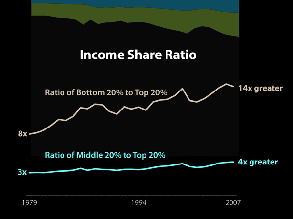
2-The Great Divergence isn’t really one trend, but two (hence the dotted line in the previous slide separating the “early” divergence from the “recent” one). Here we look at the first trend—or at least the first one economists took note of. This trend divides the population into five groups (“quintiles”) according to household income data. The top line charts income share for the bottom 20 percent (i.e., the poorest fifth) relative to the top 20 percent (the richest fifth). In 1979 the top quintile’s income share was eight times that of the bottom quintile. By 2007 the top quintile’s income share was 14 times that of the bottom quintile. The bottom line shows that the top 20 percent’s share also increased relative to the middle 20 percent, rising from three times that of the middle quintile in 1979 to four times that of the middle quintile in 2007. These trends reflect in large part a growing “college premium.” Since 1979 the income gap between people with college or graduate degrees and people without them has grown. The moderately skilled middle class is hollowing out.